Check-box select control customization
Description
Discussion
You can customize the appearance of the checkbox-select control by clicking the smart field for the Check-box select control customization property.
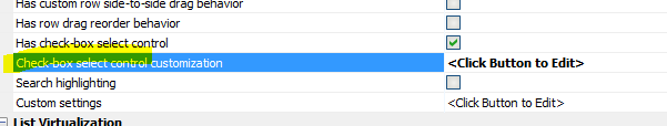
When you click the  smart field, a builder is opened.
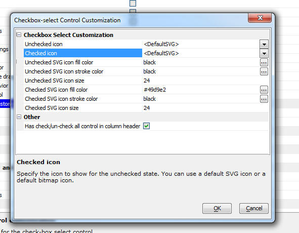
You can control whether the icons used are SVG or bitmaps (bitmaps would be preferable if you are using a legacy style such as GrBlue). You can choose custom icon.
If you use the default SVG icon you can set the size, fill and stroke color of the SVG icons.
You can also control whether an icon appears in the column header to allow the user to check or un-check all rows in the list at once.
Checkbox-select Control Customization Properties
Unchecked icon
The icon shown when the checkbox select column for the current row is unchecked. The icon can be a bitmap (<DefaultBitmap>) SVG icon (<DefaultSVG>) or custom image (<Custom>):
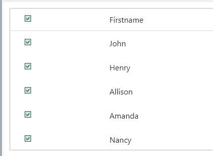
- <DefaultSVG>
Uses the "alpha-icon-circle" built-in SVG icon. See images above.
- <DefaultBitmap>
Uses the
 built-in Alpha Anywhere icon. Best for use in desktop web applications or with legacy system styles such as GrBlue.
- <Custom>
Uses an image from the project, such as an SVG Icon, CSS Icon, Image in the Web Project or Style, a Built-in Image, or an external Image specified using a URL.
Checked icon
The icon shown when the checkbox select column for the current row is checked. The icon can be a bitmap (<DefaultBitmap>) SVG icon (<DefaultSVG>) or custom image (<Custom>).
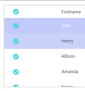
- <DefaultSVG>
Uses the "alpha-icon-checkCircle" built-in SVG icon. See images above.
- <DefaultBitmap>
Uses the
 built-in Alpha Anywhere icon. Best for use in desktop web applications or with legacy system styles such as GrBlue.
- <Custom>
Uses an image from the project, such as an SVG Icon, CSS Icon, Image in the Web Project or Style, a Built-in Image, or an external Image specified using a URL.
Unchecked SVG icon fill color
The fill color for the Unchecked SVG icon. Specified as a CSS color. Click the
for this property to select a color using the Color Picker.Unchecked SVG icon stroke
The stroke color for the Unchecked SVG icon. Specified as a CSS color. Click the
button for this property to select a color using the Color Picker.Unchecked SVG icon size
The icon's size. The size is specified as the number of pixels. The size value is used to determine the icons width and height. Default size is 24.
Checked SVG icon fill color
The fill color for the Checked SVG icon. Specified as a CSS color. Click the
button for this property to select a color using the Color Picker.Checked SVG icon stroke
The stroke color for the Checked SVG icon. Specified as a CSS color. Click the
button for this property to select a color using the Color Picker.Checked SVG icon size
The icon's size. The size is specified as the number of pixels. The size value is used to determine the icons width and height. Default size is 24.
Unchecked icon
The <Custom> icon to display when the checkbox is unchecked. The icon is from the project. Use the
button for this property to open the Select image dialog to select an image from the project.In the image below, an svg icon of a star with a grey fill has been selected as the Unchecked icon.
svgIcon=#alpha-icon-starSolid:icon,24{ fill: #eceff1;}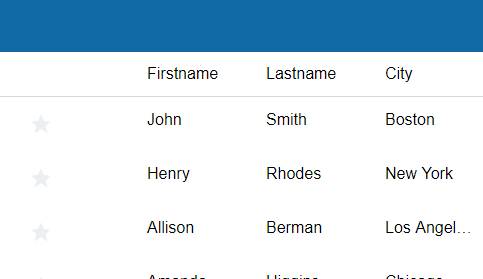
Checked icon
The <Custom> icon to display when the checkbox is checked. The icon is from the project. Use the
button for this property to open the Select image dialog to select an image from the project.In the image below, an svg icon of a star with a yellow fill has been selected as the Checked icon.
svgIcon=#alpha-icon-starSolid:icon,24{ fill: #fbc02d;}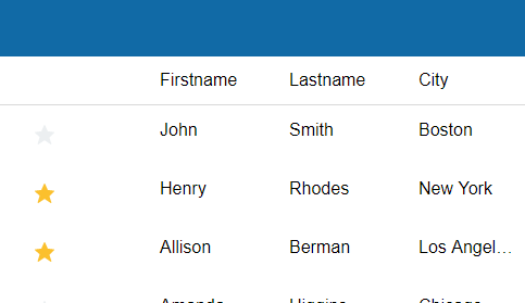
Has check/un-check all control in column header
If checked, a check/un-check all rows icon will be included in the List column header. The check/un-check all rows icon is only available in Lists using a Column layout.
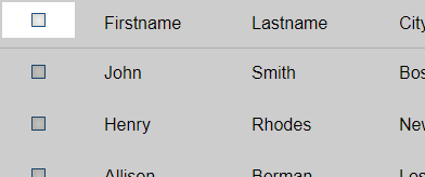 The check/un-check all rows icon is rendered using the Checked icon and Unchecked icon.
The Checkbox select column is not available for the Kanban, Custom, or Map layout.
Action Javascript
The List Control Actions Filter List - Server-side - Select Checked Rows action can be used with the Checkbox select column to filter the rows shown in the list.
Videos
Filtering a List to Show only Checked Rows
In this video, we show how a server-side filter can be applied to a List to show only the rows that have been checked.
Limitations
Column and FreeForm Layouts Only